Elements
Elements appear in the bottom left part of the Add/Edit Report Template dialog under the ELEMENTS node. These are the visual elements of the report, which actually appear in the report output, with the exception of the Element Group.
You can edit the parameters of elements either by double-clicking them in the Report Layout structure or by selecting them and choosing Edit from the toolbar.
See below for a detailed description of each element:
Chart Template
This element allows you to insert preconfigured chart templates (see Chart Template) in your report template.
When you configure this element, make settings as follows:
You must select a source. You can only select sources that have been added to the Report Layout structure and if the chart template is part of an element group, the source must be included in the same element group.
Select the chart template that you want to include. The available chart templates in the drop-down list are determined by the system by checking which chart template refers to the table that you selected as a source above. You can only select from those chart templates that have a reference to the Source that you selected (for example, they use data from that table for one of their axes).
Select whether you want to display a caption in front of the chart template in the report.
Specify the width and height of the chart template as you want it to appear in the report.
Note
If you have a chart with a legend, and the legend can appear in a single row at the bottom of the chart, it will be displayed there. If it cannot fit in a single row and it takes less then a third of the available width, it will appear on the right-hand side of the chart. That is, if you set a relatively narrow chart width (less than 400 or so, depending on the length of text in the legend items), the legend may not appear at all.
For an example about how to use chart templates, see Add Page Break, Charts of Templates.
Comments
This element has no effect on the output report. It is intended for use by report designers to document the report template itself.
Drawing Details
This element allows you to insert library items or drawings in your report template.
When you configure this element, make settings as follows:
You must select a source. You can only select sources that have been added to the Report Layout structure and if the drawing details element is part of an element group, the source must be included in the same element group. For this element, you typically select the Library or Drawing table.
In the Caption Field field, select the field from which you want to retrieve the text under the drawing. This can be Name from the Library table, or may be a function column.
If you select Automatically Rotate for Page, the system will rotate the library item to fit the layout of the report. For instance, if the report page has a portrait layout but the library item, which is a PDF document, has a landscape layout, the system will rotate the library item to fit the portrait layout of the report page.
Under View Options (Layers), you can specify whether you want to display layers or traffic lights on the drawings.
If you select Display All Layers or Display Layers Linked to Assets in Asset Source, additional selection fields are displayed:
You must select the Asset Source from which layer data should be retrieved. You can only select sources that have been added to the Report Layout structure and if the drawing details element is part of an element group, the source must be included in the same element group. Typically, the source that you select here should be linked to the Asset table.
In the Asset Field, Name Field and Colour Field fields, you specify the fields within that Source to be used for the Asset (for example, the Component_ID), the Name (such as Asset.Name, or any other field that will be meaningful), and optionally the Colour.
If you select Display Traffic Lights on Layers, you can select a preconfigured traffic light, whose colours can be displayed on the layers of the drawing.
Note
If your library item includes multiple pages (for example, a PDF document), only the first page of this library item will be inserted in the report.
Using layers or traffic lighting on layers in your drawings doesn’t work with relative assets. It only works with specifically selected assets in your layers.
For an example of using this report template element, see Add Drawing Details and Extended Simple Source with Filters.
Element Group
Element groups are used to repeat data for a series of records or to group sections of a report. For example, you can use element groups to tabulate anomalies for a series of workpacks. You can also use Conditions in an element group to make the group and all its contents only appear if the conditions are matched.
When you edit an element group, you have the following options in the Edit Element Group dialog:
Field/Checkbox Name |
Description |
|---|---|
Name |
We recommend that you specify a name that reflects the content of the element group. |
Allow Excluding Group from Export |
If selected, then when the report is being generated, the user will have the option to exclude the output contained within this group to the report. For example, you may set up an element group that outputs all Isometrics data for an asset. This typically takes some time to export, so the user can choose NOT to include the Isometrics in the generation of the report output. |
Source |
If you’re using the element group to repeat data, or you want to specify conditions for it, you’ll need to select a source for it, which must be a source inserted outside the element group. Sources inserted inside the element group can be used only by the elements within the element group. |
Sort Column/Sort Order |
Allows you to set up sorting data based on a specific column in the source table and specify if you want the order to be ascending or descending. When there are multiple values for a group, those values will be displayed in the order specified. For example, if your source is “Workpack”, you are sorting based on “Workpack.Name”, and you have workpacks “2017 Inspection”, “2018 Inspection” and “2019 Inspection”, then they will be displayed in that order in your report regardless of the order they might have in the underlying database table. If you select the Repeat Elements checkbox, the repeated elements will appear in the order specified in the Element Group. However, if the checkbox is not selected but the field is used in a Paragraph or Heading element, the field’s multiple values will all be displayed at that point in the Paragraph or Heading in the order specified in the Element Group. If the field has a single value, sort order is irrelevant. |
Repeat Elements |
If selected, all the report elements within this element group will be run once for each row in the source. |
Action |
This field appears if the Repeat Elements checkbox is selected. This allows you to control how elements are repeated based on the rows in the source. You can set up repeating the elements for all the rows or only if there are no rows in the source, or choose to set up conditions for repeating reporting elements only if specific conditions are met or not met. |
Conditions |
This field appears if you selected either of the options with conditions in the Action field. Click the |
You can drop elements, including Simple Sources, into the Element Group. On the Filters tab of a Simple Source within an Element Group, you can choose Group as a parameter, which will compare the field you have selected to the value in the current row of the Element Group’s Source.
Tip
You can use the Element Group element to make it easier to copy a group of elements to another part of this report template. Once you have added the required elements to the element group, you can use the Copy toolbar button to copy the group and then the Paste button to insert it to the report template structure.
You can find several examples of using Element Groups in the following worked examples:
For an example of using a looping Element Group, see Create Simple Source with Filters and Looping Element Group.
Multimedia Thumbnails
This element allows you to insert multimedia thumbnails in your report template.
When you configure this element, make settings as follows:
You must select a source. You can only select sources that have been added to the Report Layout structure and if the multimedia thumbnail is part of an element group, the source must be included in the same element group. For this element, you typically select the Multimedia table.
In the Caption Field field, select Name to ensure that the caption text is retrieved from the Name field of the Multimedia table. You may also select a function column that returns details about the event type and event number.
In the Repository Field, specify the field that contains the image in the database. For the Multimedia table, select Image in this field.
In the Columns field, specify in how many columns you want images to be displayed.
Select whether you want to display a caption above the image in the report.
Specify the width and height of the image as you want it to appear in the report. The aspect ratio of the thumbnails reflects the thumbnail dimensions you enter. In order to maintain the aspect ratio of images, only set one dimension, Width or Height, and leave the other dimension as 0 or blank.
Note
Multimedia Thumbnails are not supported in Dashboard reports.
When you put a multimedia thumbnail element in your report template, an additional selection parameter is added automatically. This is useful when you set up multiple columns to display images in the output but you have less images in the last row then the number of columns. In this case, you can select the Merge Last Row to Centre Images for Multiple Columns checkbox to merge the last row of the columns and display the images in the centre of the page.
For an example of using this report template element, see Add Multimedia Thumbnails with Element Group, Page Break, Section Heading.
Page Break
With the Page Break element, you can force the upcoming elements to a new page in RTF or PDF outputs, or to a new worksheet in Excel, and in addition, you can make the following settings for the layout of the report below the element:
You can define in how many columns you want data to be displayed.
You can define a header and a footer for the pages below that. You can right-click to select from a predefined set of system fields, database fields or style settings to be inserted. Note that in the HTML output, only the header is considered.
You can specify the layout (landscape or portrait) and the size (A3 and A4).
For an Excel output, you can define the title of the new worksheet by specifying it as the name of the page break. If you put a field in [square brackets] in the page break’s Name, the field will be substituted with its value in the usual way. This is particularly useful if the page break is inside an element group with the Repeat Elements option enabled; you can enter the value for this particular repeat as the page break name.
Settings that you make here persist until the next Page Break or Section Break element.
For example, you want risk charts to be displayed in a new page in RTF and you want them to be displayed in two columns. You want to use a header and a footer with specific settings and you want the page layout to be landscape. You make settings as follows:
Before the relevant Risk Chart element, add or edit the Page Break element in the Report Layout structure.
In the Edit Page Break dialog, make settings as follows:
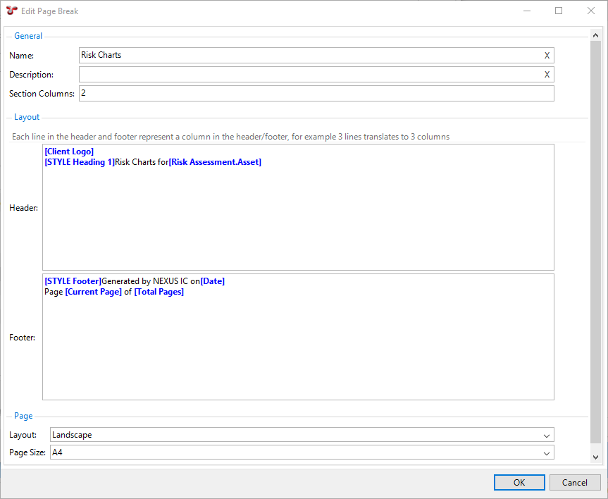
You enter the name Risk Charts, which will not be visible in the RTF, HTML or PDF output, but this name will used for the new worksheet in the Excel output.
Since you want to display the risk charts in two columns, enter 2 in the Section Columns field.
In the Header section, you want to display header data in two columns, thus, you create 2 rows for that, one for each column:
In the first column, you want to add the company logo, so you right-click and select Client Logo from the System Fields drop-down list.
In the second column, you want to add a title “Risk Charts for <Asset>”, where <Asset> is a variable and contains the Asset name and location. You want this to appear with the style that you defined for Heading 1. Thus, you add a new row and you right-click to select Heading 1 from the Set Style drop-down list. You then enter “Risk Charts for” and right-click to select .
In the Footer section, you want to display footer data also in two columns, thus, you create 2 rows for that, one for each column:
In the first column, you want to see when and by whom the report was generated. For this, you want to apply the style that you defined for Footer. Thus, you right-click and select Footer from the Set Style drop-down list. You then enter “Generated by NEXUS IC on” and right-click to select Date from the System Fields drop-down list.
In the second column, you want to display the current page number out of the total number of pages.. For this, you add a new row and enter “Page [Current Page] of [Total Pages]”, where you choose [Current Page] and [Total Pages] from the System Fields drop-down list available by right-clicking.
In the Layout field, select Landscape.
Click OK to apply the changes.
Result
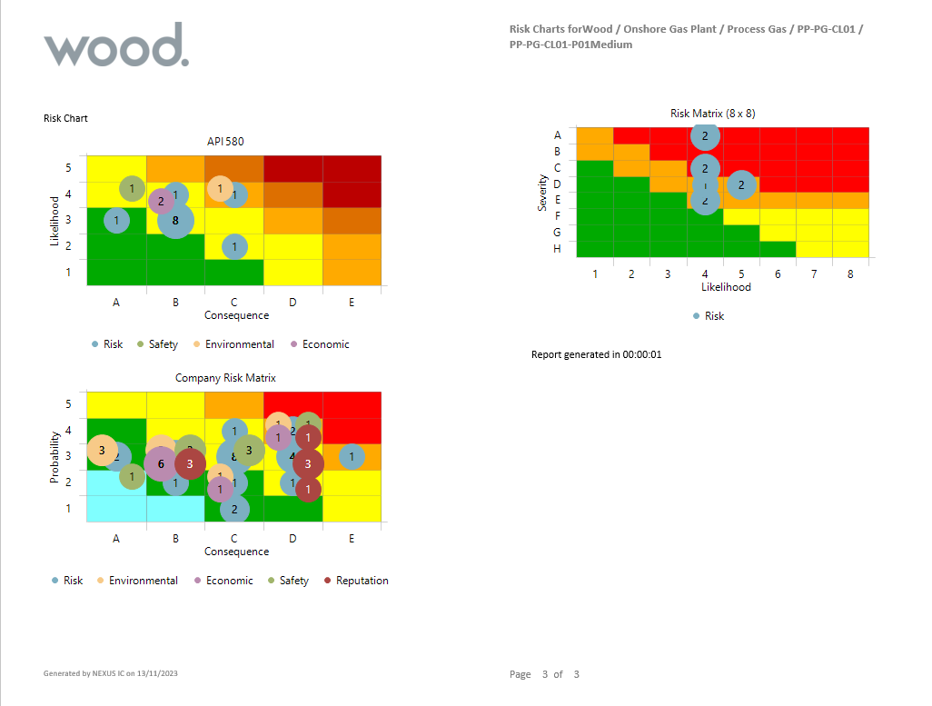
When you generate the output, the new page will look in the RTF output as follows:
Pivot Table
Pivot tables are conceptually similar to pivot tables in Excel. They aggregate data from many rows of a data source into just a few rows, according to the rules you set up. For example, you can add a table that shows how many tasks are in each of your workpacks, you can even break the table up by task completion, and so on.
When you create or edit a pivot table, you have the following options on the Properties tab of the Edit Pivot Table dialog:
Field/Checkbox Name |
Description |
|---|---|
Name |
We recommend that you specify a name that reflects the content of the pivot table. To customize the table name in your rendered report, you can right-click in the Name field and choose fields from the drop-down menu that appears. If the Show Caption checkbox is selected, the selected fields will be incorporated into the title of the table. This is especially useful when the table is inside an element group with the Repeat Elements option enabled, as you can include the value for that particular repeat in the table name. |
Description |
You can provide additional information about the pivot table in this field. This content will appear in the Description column of the Configuration - Templates dialog. |
Show Caption |
If you select this checkbox, the table’s name will be shown above the table in the generated report. |
Show Column Totals |
Enabling this option adds an extra row at the bottom of the table showing the aggregate of values in each column. |
Show Row Totals |
Enabling this option adds an extra column with the aggregate of each row. If you have several Values, it will add several columns, one showing the aggregate of each. |
Show Zero Values |
By default, this option is enabled and zero values are shown in the output. If you disable this option, any values that would have shown “0” will be replaced with a blank. This makes it easy to spot data in a sparsely populated grid. |
Show Rows with All Zero/Blank Values |
By default, this option enabled and if a row contains “0” value or no value at all, it will be shown in the output. If you disable this option, these rows will be hidden. This limits the pivot table to only rows which have aggregate data. |
Show Dash Instead of “NaN” |
By default, this option is enabled and if a cell has a value that is “Not a Number” (“NaN”), a dash will be shown in that cell. If disabled, the output will appear as “NaN”. |
Fit Window |
If you select this checkbox, NEXUS will limit the width of the table generated to fit the width of the page in RTF or PDF file or the browser window in HTML. However, if you deselect this checkbox, the table will be as narrow or as wide as is necessary to display all the data. Note that Microsoft Word’s RTF reader may not respect this setting properly. To ensure proper formatting, save the document in .docx format by clicking “Save As” in Word. |
Style Prefix |
This field allows you to define a Style Prefix. |
Source |
Select the source which the pivot table should retrieve data from. You can only select sources that have been added to the Report Layout structure and if the pivot table is part of an element group, the source must be included in the same element group. Selecting a source for a pivot table is mandatory. You can also have a more complex source: for example, if you only wanted to see incomplete tasks, you would put a filter in your Simple Source for Is Completed not equal to true. If you wanted to use a single Simple Source to show both all tasks and all completed tasks, then instead of filtering the Simple Source, you would add an extra field to it, with a function that returns 1 if the task is complete and 0 if it is not. Then you would add a Values row to Sum that function. |
Rows |
In this screen area, you add the fields based on which you want to group the rows of your table. The values of these fields will appear then in the left-hand side column of the pivot table. Choose Add to add a new field row and select a field from the drop-down list. The available fields are the fields from the database table that you selected as a source. For example, if you wanted to see how many tasks were in each workpack, you would set up a Simple Source on the Task table, and under Rows, you would choose Workpack as the Row field to pivot on. If you wanted that broken up by task completion, you would choose Workpack and Is Completed as Rows. The table would then contain two rows for each workpack that had both complete and incomplete tasks. Adding field rows to a pivot table is mandatory. |
Columns |
Optionally, you can break down data into additional categories and display them in separate columns. For example, you have a pivot table for Anomalies where you have a row for each anomaly ID and you calculate the number of anomalies for each anomaly code in each row. You want to split this data and see the count separately for the different closed-out statuses of the anomaly, which can be either ‘Open’ or ‘Closed’. In this case, you add the field Closed Out in this Column area and in the output, you will see two columns: Open and Closed, with the total number of anomalies for each closed-out status displayed separately in two different columns. |
Values |
In this screen area, you define the main criteria based on which the system should calculate the output values. Choose Add and define the following parameters:
Specifying value entries for a pivot table is mandatory. You can also specify several different Values entries. For example, you can add a second Values entry on ‘Approx Timing’, with an Aggregate of Sum, and a name like ‘Total Time Estimate’. Each additional Values entry will result in an extra column in the output table. |
The Styles tab lets you set conditional Styles for this table. In your Conditions, set Field to [Column Name], Comparison to Contains, and Value to the column name. This is because as far as the pivot table is concerned, it’s not using the underlying data source column — it’s using a new pivot table column with a similar name.
Example
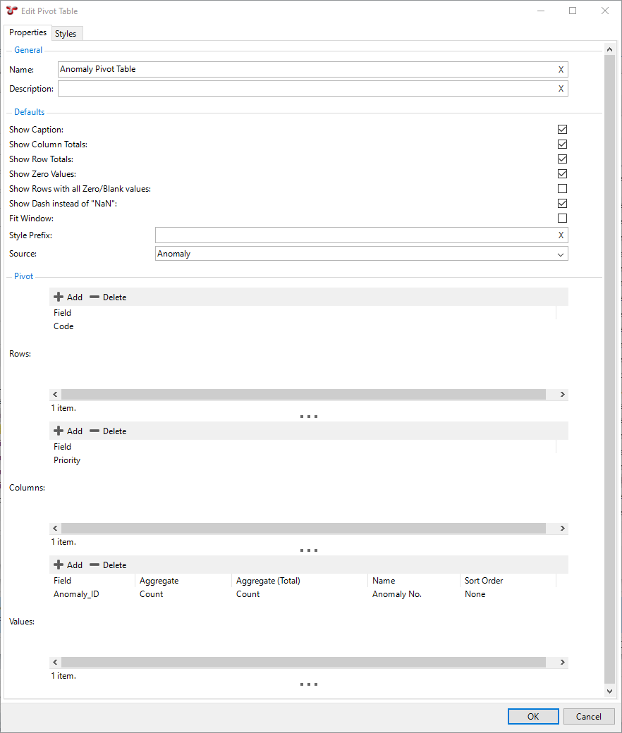
You want to create a pivot table for Anomalies, where you want to see the number of anomalies for each anomaly code. You also want to see the number of anomalies broken down based on the priority of the anomalies and you want to see the total number of anomalies for each anomaly code and each priority. In this case, you make settings in the Edit Pivot Table dialog as follows:
You tick the Show Row Totals and Show Column Totals checkboxes.
You select the Anomaly table as a source.
You add a row field for anomaly codes (Code).
You add the column field Priority.
You add a Value entry for the field Anomaly_ID and select Count for both Aggregate values.
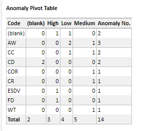
In this case, the pivot table in the report output appears as follows:
For further examples of using pivot tables, see Example: Set Up Workpack Report Template.
Risk Chart
This element allows you to insert preconfigured risk charts in your report template.
When you configure this element, make settings as follows:
You must select a source. You can only select sources that have been added to the Report Layout structure and if the risk chart is part of an element group, the source must be included in the same element group. Note the following:
Most often, you use the Risk Assessment table as a source for your risk models.
You can also use the Anomaly table, in which case, each anomaly’s risk score is used to place it on the diagram. Anomalies do not have a Likelihood or Consequence to give them an X/Y position on the diagram, they only have a risk score. So if your diagram has several squares with the same risk score (as is usually the case), your anomalies will be placed in the left-most such square. That is, risk-assessed assets are placed in a particular square, but anomalies are merely placed in a particular band. To make this risk model work, you must have made the following settings:
You must have specified the risk chart in the Anomaly Risk Chart field on the Database tab under .
You must have set up the System - Anomaly - Risk Score function that calculates the risk score for each anomaly.
For more information, see Set Up Anomaly Risk Matrix.
Select whether you want to display a caption in front of the risk chart in the report.
Select the Show Count checkbox if you want to show the number of risk results in each square that has risk results. If you do not select this option, you will only see a dot in each square that has one or more risk results.
Specify the width and height of the risk chart as you want it to appear in the report.
For an example of using risk charts, see Add Risk Charts with Element Group, Page Break, Section Heading.
Section Break
Similar to Page Break above, but it does not force a new page and does not let you choose paper size and orientation.
Section Heading
This element lets you set up headings in your report. You can configure section headings as follows:
In the Name field, enter the name of the section heading to identify the heading within the Report Layout structure. This text does not appear in the actual report output.
Right-click within the Content field to insert a list of fields and styles, or simply type text. This will appear as the actual section heading text in the report output.
Select the Include in Table of Contents checkbox to have this section heading appear in the Table of Contents.
In the Default Style field, select the preconfigured style that you want to apply for the section heading. For more information about the preconfigured styles, see Styles.
Section headings are applicable only for RTF, HTML and PDF outputs. Section Headings are not supported in Dashboard reports, you can use a Text (Paragraph) element instead.
You can find several examples of using Section Headings in the following worked examples:
Table of Contents
The Table of Contents element inserts a hyperlinked Table of Contents in the report output. In HTML outputs, any section headings will appear with “Top of report” hyperlink.
To configure the appearance of table headings, use the elements starting with TOC in your generic report style configurations (see Styles).
This element is applicable only to RTF and HTML outputs. Table of Contents elements are not supported in Dashboard reports.
Note
In the RTF output, you must right-click and update the table of contents to ensure that page numbers appear correctly.
For an example of using this report template element, see Insert Table of Contents, Verify Output.
Table of Data
The Table of Data element outputs a simple table with columns and rows and retrieves data from a Source assigned to it.
When you create or edit a table of data, you have the following options in the Edit Table of Data dialog:
Field/Checkbox Name |
Description |
|---|---|
Name |
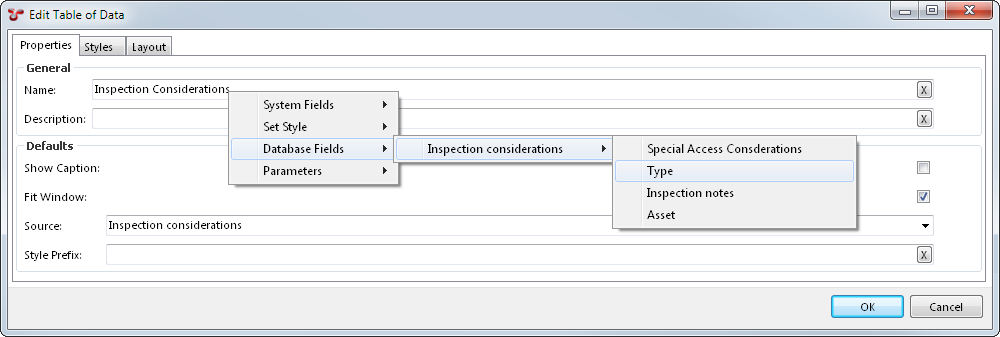
We recommend that you specify a name that reflects the content of the table of data. To customize the table name in your rendered report, you can right-click in the Name field and choose fields from the drop-down menu that appears. If the Show Caption checkbox is selected, the selected fields will be incorporated into the title of the table. This is especially useful when the table is inside an element group with the Repeat Elements option enabled, as you can include the value for that particular repeat in the table name. |
Description |
You can provide additional information about the table of data in this field. This content will appear in the Description column of the Configuration - Templates dialog. |
Show Caption |
If you select this checkbox, the table’s name will be shown above the table in the generated report. |
Fit Window |
If you select this checkbox, NEXUS will limit the width of the table generated to fit the width of the page in the RTF or PDF file or the browser window in HTML. However, If you deselect this checkbox, the table will be as narrow or as wide as is necessary to display all the data. Note that Microsoft Word’s RTF reader may not respect this setting properly. To ensure proper formatting, save the document in .docx format by clicking “Save As” in Word. |
Hide Columns with No Values |
If you select this checkbox, any column that is entirely empty will be omitted from the output report. |
Merge Cells for Rows with Equal Values |
If you select this checkbox, the report output will minimise repetition of information by merging any adjacent matching cells in the table. If you don’t select it, adjacent matching cells will not be merged. Note that this setting is ignored in Excel outputs. |
Show Table if Empty |
If you select this checkbox, empty tables will still be displayed with column names without data. Otherwise, empty tables will be entirely omitted from the report. |
Style Prefix |
This field allows you to define a Style Prefix. |
Source |
Select the source which the table of data should retrieve data from. You can only select sources that have been added to the Report Layout structure and if the table of data is part of an element group, the source must be included in the same element group. If you click OK after selecting a Source, a drop-down arrow appears next to the Table of Data. This shows the Simple Source you have attached to the table. This is the same object as the Simple Source shown elsewhere in the tree. If you change one instance of the simple source, it will make changes to the other. If the Simple Source is connected to several tables, for example, Drawing Details, Chart Templates, or Risk Charts, making changes to any one will make changes to all. |
The following image shows the right-click option available from the Name field:
The top half of this tab lists all the columns that will be included in the table. You can do the following here:
Choose which columns are visible in the report by selecting the relevant option from the Visible column. You can choose Include All or Exclude All to make all the columns in the list visible or invisible, respectively.
Assign columns to a category. If you place several columns in the same category, they will be grouped together and the category headers will be visible in the generated report. Note that categories are only considered in the HTML, RTF and PDF outputs, they are ignored in the Excel output.
Define the alignment of content within the cell for each column.
If the Show Data button is set to All Data, NEXUS will display data from the table specified in this table’s source, complete with any extra columns you may have added. This can give context and make it easier to understand what the final generated table will look like.
Caution
If the table contains many rows, this may take up to 5 seconds. After this time, NEXUS will stop fetching additional rows, and will display only the rows that it has fetched.
The bottom part of the tab shows how the columns will be displayed in the output. You can perform the following actions here:
Drag and drop column headings to reorder them in your table.
Click on one or more column headings to sort by that column. Shift-click a column to add it; Ctrl-click a column to subtract it from the set of columns we’ll sort on. Click or shift-click a column a second time to change sort direction.
You can change the width of columns by hovering the mouse over the right edge of the column header, and then either double-clicking or by clicking and dragging the column to a new width. This will change the column widths in the generated report.
You can use this tab to highlight table cells or rows, use particular fonts, sizes or colours, change spacing, and to change the lines used to draw the table. You can choose a style here to be used when particular conditions are matched. You can also add a legend to explain what a special formatting refers to, which will appear under the table.
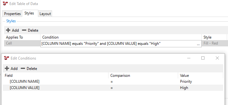
A style can be applied to a row or to a cell. If you want it to apply to a cell, be sure to set your condition to include “[COLUMN NAME] equals” in addition to the value you actually want to filter on, in order to restrict the filter to just that cell.
For example, you want to highlight cells where the Priority column value is High with red colour. In this case, you do the following:
On the Styles tab page, click Add.
In the Applies To column, select Cell from the drop-down list.
Double-click in the Conditions column and click the ellipsis
, which opens the Edit Conditions dialog.
Add two conditions, one for the COLUMN NAME field that equals to Priority and one for the COLUMN VALUE field that equals to High:
Click OK.
Back on the Styles tab, in the Style column, select the Fill - Red style.
In the Legend Label column, enter High Priority Anomalies. The red colour and this text will be added as a legend at the bottom of the table.
Click OK.
Result
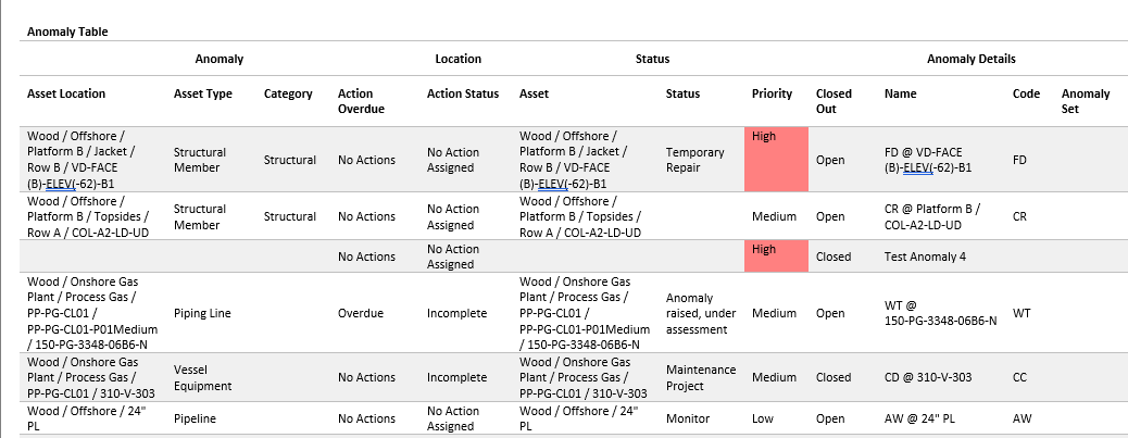
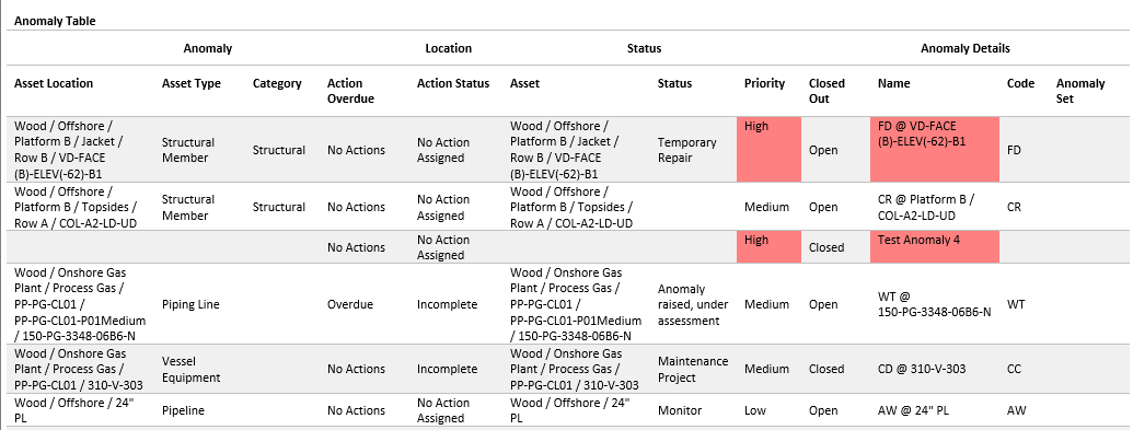
When you generate the output, in the Priority column, cells with the value High will be highlighted by red:
Let’s say that you also want to highlight the Asset Name cell for the items that have the Priority value High. In this case, follow the process above except that you create one condition for the COLUMN NAME field that equals to Name and one for the Priority field that equals to High:
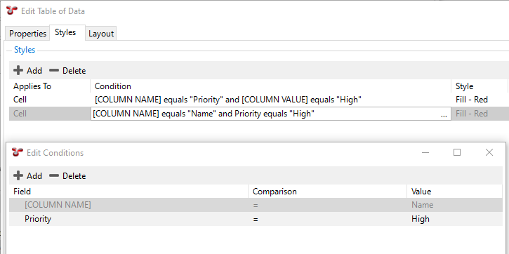
Result
In this case, when you generate the output, the corresponding Name cell will be highlighted with red too:
Note
To add/edit/delete styles that you can apply, go back to the Configuration - Templates dialog and choose the Styles toolbar button.
For an example of using this report template element, see Create Table of Data for Anomaly List, Apply Styles.
Text (Paragraph)
Text entered in the Content field will be displayed as text in the report output. You can enter your text directly or you can use the right-click menu to insert:
System fields, such as date, logo, image, and so on
Database fields, which you can choose from a single source that the element can access (that is, the source has been added to the Report Layout structure and is in the same element group)
Styles to be applied to the paragraph text. If you insert a style element, any text that appears after that element will have that specific style applied until the next style element. By default, the Body style will be applied. For more information about the preconfigured styles, see Style).
Note that some styles are only applicable to specific output types, for example, heading styles are only applicable to RTF, HTML and PDF outputs, but not to Excel outputs.
For examples of using this report template element, see Example: Set Up Workpack Report Template.
Vertical Table
The Vertical Table element is similar to the Table of Data element, but rotated by 90 degrees. In a Vertical Table, the left-most column contains the ‘column headers’.
Vertical Tables are useful when you have a single record with lots of fields in it, for example, a checklist item or an event definition with lots of fields.
The settings for a Vertical Table are the same as the settings for a Table of Data element. For more information, see the description of the Table of Data element above. The only difference is that in the case of a Vertical Table, you can set the width of the header column by setting a Header Width (%) value, which determines the percentage of the header column width as compared to the width of the whole table.
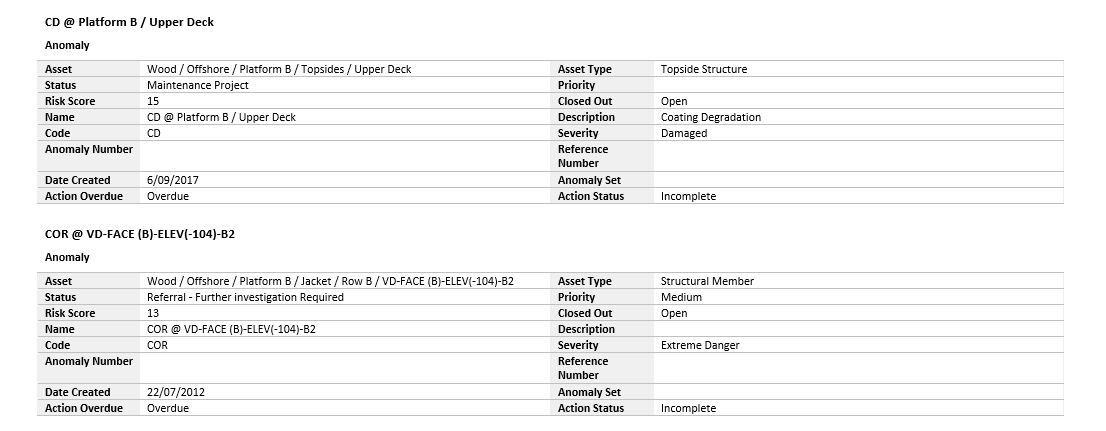
Entering 2 or more Number of Header Columns arranges the output fields in a form-like layout. This is most commonly used when you are outputting the details of a single record.
In the example below, the Vertical Table is included in an element group that loops on each anomaly. The Vertical Table has a single source assigned, which is filtered on the Anomaly ID field of the Anomaly table and the number of header columns is set to two:
For an example of using this report template element, see Create Section Heading, Vertical Table with Extended Simple Source.