Configure Risk Charts
The first step of setting up a risk model is configuring a risk chart, where the risk results can be displayed on. You create risk charts under .
One chart can be used by several risk models (see risk models).
Risk matrixes are displayed on the ASSETS screen, on the Risk tab (see Risk).
Set Up a Risk Chart
The following example shows the steps of setting up a new risk chart:
Under , click Add at the top of the Configuration - Risk Charts dialog.
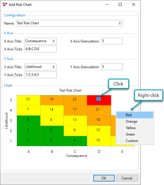
In the Add Risk Chart dialog, enter a name that uniquely identifies the risk chart.
Specify the X and Y axis parameters as follows:
Field Name
Description
X Axis Title
Specifies the title of the X axis.
X Axis Granulation
Indicates to how many squares you want to split up the X axis (width).
X Axis Ticks
Indicates the name of each square on the X axis. Enter the values separated by semicolon. For example, if your risk chart is 5x5, your X axis ticks can be defined as “A;B;C;D;E”, or “Negligible;Mild;Moderate;Major;Severe”, whatever your risk model requires.
Y Axis Title
Specifies the title of the Y axis.
Y Axis Granulation
Indicates to how many squares you want to split up the Y axis (height).
Y Axis Ticks
Indicates the name of each square on the Y axis. Enter the values separated by semicolon. For example, if your risk chart is 5x5, your Y axis ticks can be defined as “1;2;3;4;5”, or “None;Low;Medium;High;Extreme”, whatever your risk model requires.
Under Chart, set up the risk colours and numbers as follows:
Right-click a cell to set the colour. Choose a predefined colour or choose Custom to get a colour picker dialog.
Click within the cell to enter a whole number risk value. The higher the number, the more severe the risk is.
See also