Elements
Element Group
Element Groups are used to repeat data for a series of records or to group sections of a report. For example, to tabulate anomalies for a series of workpacks. You can also use the Conditions in an Element Group to make the group and all its contents only appear if the conditions are matched.
If you’re using this Element Group to repeat data, or if you wish to specify Conditions for it, you’ll need to select a Source for it. (It must be a Source outside the Element Group.)
If you check the Repeat Elements box, all the report elements within this element group will be run once for each row in the source.
The Element Group plays nicely with the Copy An Element button on the Report Template dialog toolbar — if you suspect you might later wish to copy a group of elements to another spot in this report template or into another report template, put them in an Element Group as you create them, for easy copying later.
Ticking Repeat Elements will also cause the Action drop-down to appear. You can select ‘All Rows’, ‘Only rows that match conditions’, ‘Only rows that don’t match conditions’, or ‘Only when there are no rows’. If you select either of the ‘conditions’ options, the Conditions box will appear. Click its  button to add, edit or delete conditions. Conditions can be on a field in the source, or on the number of rows in the source, or the index of the row, and can compare (=. <, >, <=, >=, <>, contains) to a constant value.
If you configure Sort Column and Sort Order, then when there are multiple values for a group, those values will come out in the order specified. If your source is Workpack, you are sorting on Workpack.Name, and you have workpacks “2017 Inspection”, “2018 Inspection” and “2019 Inspection”, then they will come out in that order in your report regardless of the order they might have in the underlying database table. If you have ticked Repeat Elements, the repeats will be in the specified sort order; if not, but the field is consumed e.g. in a Paragraph or Heading element, then the field’s multiple values will all appear at that point in the Paragraph or Heading in the order specified here in the Element Group. (If the field has a single value, sort order is of course irrelevant.)
You can drop elements, including Simple Sources, into the Element Group. In the Filters tab of a Simple Source within an Element Group you can choose a Parameter of Group. This will compare the field you have selected to the value in the current row of the Element Group’s Source.
Text (Paragraph)
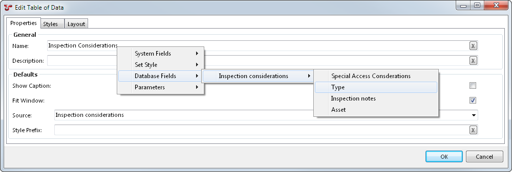
Text entered into the Content field will be displayed as text in the report output. Use the right-click menu to insert System Fields, Database Fields, Parameters, or set the style of the paragraph text (the Body style will be applied by default).
Comments
This element has no effect on the output report. It is intended for use by report designers to document the report template itself.
Section Heading
This element lets you set up headings in your report. Right-click within the Content box to get a list of styles and fields, or simply type text. Check the Include in Table of Contents checkbox to have this section heading appear in the Table of Contents.
Section Headings are not supported in Dashboard reports — use a Text (Paragraph) element instead.
Table of Data
You can edit the Table of Data by double-clicking it, and choose a Source. If you only have one Source in the report template, only one item will be shown on the drop-down list.
If you click OK after selecting a Source, you will see a ‘+’ next to the Table of Data. This shows the Simple Source you have attached to the table. This is really the same object as the Simple Source shown elsewhere in the tree — making changes on one will make changes on the other. If the Simple Source is connected to several tables, Drawing Details, Chart Templates, or Risk Charts, making changes to any one will make changes to all.
Hint
Once you have set up a Table of Data, and have connected it to a Simple Source which in turn has a database Table selected, you have a basic report which can be generated to RTF, HTML, or Excel.
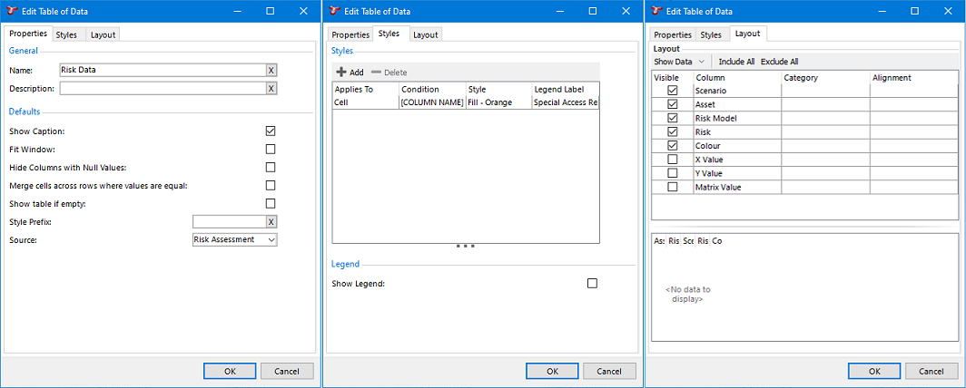
If you give the Table of Data a Name, and check the Show Caption checkbox, the table’s name will be shown above the table in the generated report.
If you check the Fit Window box, NEXUS will constrain the width of the generated table to the width of the page (in RTF) or the browser window (in HTML). If you uncheck this box, the table should be as narrow or as wide as is needed to display the data. Please note that Microsoft Word’s RTF reader does not respect this setting well. To get Word to respect the setting, it is necessary to encourage it, for example by clicking Save As in Word and choosing .docx as the save format.
If you check Hide columns with Null Values, then any column which is entirely empty will be omitted from the output report.
If you check Merge cells across rows where values are equal, the report output will minimise repetition of information by merging any adjacent matching cells in the table. Leaving it unchecked will leave adjacent matching cells unmerged.
If you check Show table if empty, tables which are empty will show their column names without data in the columns. If left unchecked, empty tables will be entirely omitted from the report.
Style Prefix lets you set a Style Prefix.
Layout
The top half of this pane lists all the columns. Tick or untick to make columns visible or invisible. If you place several columns in the same Category, they will be grouped together. Any Category headers will also be visible in the generated report.
If the Show Data button is set to All Data, NEXUS will display data from the table specified in this table’s source, complete with any extra columns you may have added. This can give context and make it easier to understand what the final generated table will look like.
Caution
If the table contains many rows, this may take up to 5 seconds. After this time, NEXUS will stop fetching additional rows, and will display only the rows that it has fetched.
Click on one or more column headings to sort by that column. Shift-click a column to add it; ctrl-click a column to subtract it from the set of columns we’ll sort on. Click (or shift-click) a column a second time to change sort direction.
You can change the width of columns by hovering the mouse over the right edge of the column header, and then either double-clicking or by clicking and dragging the column to a new width. This will change the column widths in the generated report.
Styles
The Styles tab can be used to highlight table cells or rows, use particular fonts, sizes or colours, change spacing, and to change the lines used to draw the table. You can choose a style here to be used when particular conditions are matched.
A style can be applied to a row or to a cell — if you want it to apply to a cell, be sure to set your Condition to include “[COLUMN NAME] equals” in addition to the value you actually want to filter on, in order to restrict the filter to just that cell.
To add/edit/delete styles themselves, drop back out to the Configuration - Templates dialog and click the Styles button.
Title Fields
If you right-click in the Name field, you will get a pop-up menu similar to the one available in Text or Section Heading elements. You can choose fields from this menu and (assuming that the Show Caption box is ticked) these fields will be built into the title of the table in the rendered report. This is particularly useful if the table is inside an Element Group with Repeat Elements ticked — you can put the value for this particular repeat into the table name. This right-click also works for Vertical Table, Pivot Table, Risk Chart, and Chart Name fields.
Vertical Table
The Vertical Table element is like the Table of Data element, but rotated 90 degrees: what would be a column in one is a row in the other. ‘Column headers’ are in the left-most column.
Show Caption, when checked will output the Name of the Vertical Table directly above the Vertical Table.
When output to RTF, Fit Window will make the Vertical Table stretch from the left page margin to the right page margin.
If you check Hide columns with Null Values, then any output row which is entirely empty will be omitted from the output report.
Style Prefix lets you set a Style Prefix. The Styles tab lets you set conditional Styles for this table.
You can choose how wide the header Column is by setting a Header Width (%) value.
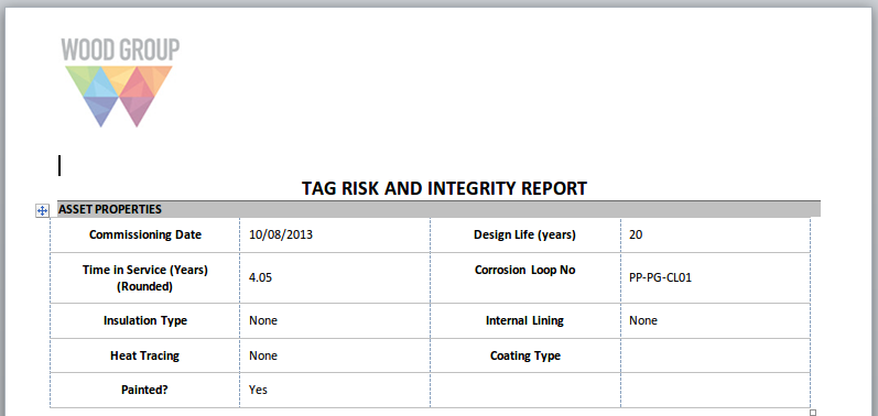
Entering 2 or more Number of Header Columns arranges the output fields in a form-like layout. This is most commonly used when you are outputting the details of single record. Example shown here:
Pivot Table
Pivot tables are conceptually similar to pivot tables in Excel. (If you aren’t familiar with those, you may wish to Google for a tutorial.) They aggregate data from many rows of a data source into just a few rows, according to the rules you set up.
As always, you’ll need to start by selecting a Source for your pivot table element. Then choose one or more Rows. For example, if you wanted to see how many tasks were in each workpack, you would set up a Simple Source on the Task table, and in your pivot table you would choose Workpack as the Row field to pivot on. (If you wanted that broken up by task completion, you would choose Workpack and Is Completed as Rows — the table would then contain two rows for each workpack that had both complete and incomplete tasks.) Under Values, click Add, and select criteria. if you wanted a simple count of tasks, you would choose Task_ID as the Field, Count as the Aggregate, and choose a Name like ‘Number of Tasks’. That completes the minimum for a Pivot table element: a Source, a Row Field, and a Values entry.
You can do much more with pivot tables, though: you can have several different Values entries. For example, you might add a second Values entry on Approx Timing, with an Aggregate of Sum, and a name like ‘Total Time Estimate’. Each additional Values entry will result in an extra column in the output table.
You can separately choose the Aggregate (Total), which is the value shown under Column Totals or Row Totals (if selected). Often you want the same aggregate for cells within the table and for end-of-row or end-of-column values (for example, for a Value where you’ve chosen Average, your might want Totals to also be Average, giving a grand mean), but sometimes you want the Total value to have a different aggregate from cells within the table proper.
You can also add entries under Columns. If you added, say, Category, under Columns, and your tasks were assigned to different categories, then you output would have one column per category for whatever your Values entry specified. If you add items under both Columns and Values, then it works multiplicatively: if your Tasks fell into five different Categories and you had two different Values, you’d get 10 columns of numbers out. For each Column you select you will get a common table “band” header, and within each band you’ll get columns for each Value.
You can also have a more complex source: for example, if you only wanted to see incomplete tasks, you would put a filter in your Simple Source for Is Completed not equal to true. If you wanted to use a single Simple Source to show both all tasks and all completed tasks, then instead of filtering the Simple Source, you would add an extra field to it, with a function that returns 1 if the task is complete and 0 if it is not. Then you would add a Values row to Sum that function.
Under Values, you can choose the Sort Order by which to sort the aggregate values. This will order the rows of the table by either Ascending or Descending order and will only order by the first column of aggregate values.
There are checkboxes near the top of the Pivot Table element. Show Caption does the same thing as for a Table Of Data: it shows the Name as a caption above the table.
Show Column Totals adds an extra row at the bottom of the table showing the aggregate of values in each column. Show Row Totals works similarly except that it adds an extra column, with the aggregate of each row. If you have several Values, it will add several columns, one showing the aggregate of each.
Show Zero Values, by default is checked. If unchecked, will replace any values that would have shown “0” with a blank. This makes it easy to spot data in a sparsely populated grid.
Show Rows with all Zero/Blank values, by default is checked. If unchecked, rows which contain all “0” or blanks are not shown. This limits the pivot table to only rows which have aggregate data.
Show Dash instead of “NaN” by default is checked. If unchecked, then “NaN” (Not a Number) will be output as “NaN”.
Fit Window doe the same as for a Table Of Data: it will attempt to make the table as wide as the browser window or Word page.
Style Prefix lets you set a Style Prefix.
The Styles tab lets you set conditional Styles for this table. In your Conditions, set Field to [Column Name], Comparison to Contains, and Value to the column name. This is because as far as the pivot table is concerned, it’s not using the underlying data source column — it’s using a new pivot table column with a similar name.
Chart Template
Choose a Source. Choose a Chart Template which you have already configured. Only Chart Templates relevant to your Source will be available for selection.
For charts with legends: if the legend can appear in a single row at the bottom of the chart, it will. Otherwise, it will attempt to appear at the right-hand side of the chart. But in this case it will only appear if it will take less than a third of the available width. So if you set a relatively narrow chart width (less than 400 or so, depending on the length of text in the legend items), the legend may not appear.
Risk Chart
Choose a Source. Typically, your source for this element will use Risk Assessment as its Table. If you click Show Count, your final risk chart will have a number in each square that has risk results, showing how many risk results are in that square. If not, it will merely have a dot in each square with one or more risk results.
You can also use the Anomaly table as the Source for a Risk Chart. Each anomaly’s Risk Score is used to place it on the diagram. Note that anomalies do not have a Likelihood or Consequence to give them an X/Y position on the diagram — they only have a Risk Score. So if your diagram has several squares with the same Risk Score (as is usually the case), your anomalies will be placed in the left-most such square. That is, risk-assessed assets are placed in a particular square, but anomalies are merely placed in a particular band.
To make this matrix work, you will need to configure . You will also need to configure the “System - Anomaly - Risk Score” function.
Multimedia Thumbnails
Choose a Source. Typically, your source for this element will use Multimedia as its Table. Caption may be Name from the Multimedia table, or may be a function column that returns details about the event type and event number. Repository Field should be Image from the Multimedia table.
The aspect ratio of the thumbnails will reflect the thumbnail dimensions you enter. In order to maintain the aspect ratio of images, only set one dimension, Width or Height, and leave the other dimension as 0 or blank.
Multimedia Thumbnails are not supported in Dashboard reports.
Drawing Details
Choose a Source. Typically, your source for this element will use Library as its Table. Caption Field is used for the text underneath the drawing, and may be Name from the Library table, or may be a function column.
Under layers, if you select “Display all layers” or “Display only layers that are associated with assets in asset source”, you can specify a Source, and then specify the fields within that Source to be used for the Asset (i.e. the Component_ID), the Name (such as Asset.Name, or any other field that will be meaningful to the person reading the report), and optionally the Colour.
Page Break
In RTF, in addition to forcing output onto a new page this element lets you set headers and footers for your document. You can select a number of Columns for this section of the report. Settings chosen here for Section Columns, Layout, Page Size and Header and Footer persist until the next Page Break element.
In Excel, this starts a new worksheet, with the Name of the page break used for the name of the worksheet. If you put a field in [square brackets] in the page break’s Name, the field will be substituted with its value in the usual way. This is particularly useful if the page break is inside an Element Group with Repeat Elements ticked — you can put the value for this particular repeat into the page break name.
In HTML, this has no effect.
Section Break
Similar to Page Break above, but will not force a new page and does not let you choose paper size and orientation.