Charts
The Charts window will list all of the Chart Templates that are appropriate for the inspection data shown in the Event Listing window. If you don’t see any charts listed, try different types of events, by changing asset or by changing your filters. Charts will only show event data included in your filters (workpacks, event types, column-specific filters, etc). If your Chart Template is on Continuous Event data (such as cross-profiles), ensure that you select that Continuous Event in your event type filter.
To expand/collapse each chart, click the  button at the top right of that chart, or click the chart’s grey header row.
If a chart is misconfigured, you will see a message explaining this in place of the chart. Go to Chart Templates to resolve the described problem.
Charts are generated from Chart Templates. For details on setting these up, see Chart Templates.
Available charts will be listed alphabetically. The first chart will be automatically expanded.
Events with Findings will be shown on the chart in red.
For some Chart Templates, at the right or the bottom of the chart is the chart legend. If you hover the mouse over an item on the legend, other series on the chart will fade out temporarily. If you click an item on the legend, that series will be toggled on/off. If you export the chart (see below), only series currently visible will be exported.
Chart Width
When the Charts pane is 1000 pixels wide or less, all charts are shown at the full width of the chart pane. When the Charts pane is over 1000 pixels wide, some charts are shown full width, and some are shown half width, in order to fit more charts side-by-side onto your screen.
Charts that have an X axis of type string, date, or date/time, or whose X axis includes ‘KP’ are always shown full width. Of course, you can adjust the width of all charts by adjusting the width of the whole application window, adjusting other elements such as the asset tree wider/narrower, etc.
Zooming
At the bottom of most Chart Templates, below the horizontal scrollbar (if visible) is the Zoom Bar. You can hover the mouse over the left or right end of the selected part of the Zoom Bar and drag to change the selection. Initially the entire Zoom Bar will be selected, so hover the mouse over the left or right end of the bar and drag. Once a subset of the chart is selected, you can use the scroll bar or the Zoom Bar to drag the whole selection area without zooming.
You can also zoom in or out by clicking in the chart area and (with the mouse cursor still inside the chart area) spinning the mouse wheel. For charts with a lot of data (thousands of events) this can be slow, so the Zoom Bar may be faster. You can zoom on a single axis by putting the mouse pointer over that axis and spinning the mouse wheel. Not all charts support zooming in both axes.
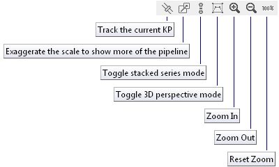
You can also control zoom with toolbar buttons Zoom In, Zoom Out, and Reset Zoom.
Charts Toolbar
There is no toolbar for the whole Charts panel. Instead, each chart has its own toolbar.
- Zoom in.
- Zoom out.
- Resets to default zoom level.
- Click this button to open the Export dialog. Ensure the range you want is set correctly using the Zoom Bar. Ensure the series you want to export are visible. If you would like to export the chart as a series of images, each covering a smaller horizontal range, enter the range you would like each chart to cover in the Range of X Axis per image field. For example, if you have a 300km pipeline and you enter “10” as the range per image, it will be broken into 30 images, each covering 10km.
- Copies the chart, as you see it displayed, without the “zoom” section at the bottom, to the clipboard.
- Expand/collapse display of this chart.
There are also several buttons specific to the Pipeline View chart:
- This button is only available in IC-Inspection. When selected, the pipeline view will move in time with the KP value coming in from survey. For NEXUS IC, see on the Inspections Toolbar.
- When selected, will distort the scale of the pipeline to make a greater KP range visible.
- When selected, will move events above the pipeline to make them more obvious. Different events will be moved up different distances so that all are easily distinguishable.
- When unselected, you will see the pipeline viewed from the side. When selected, you will see the pipeline viewed from above and slightly off to one side.
Tip
Click on the chart area and then, with the mouse cursor still inside the chart area, use your mouse wheel to increase/decrease the chart scale for export.
Report Table Sources
To extract chart template data into a report template, use a Chart Template element in the report, and use the appropriate Asset table or Event table as a source. For more information see Report Templates.