Chart Templates
In the top half of the dialog, you can add, edit and delete chart templates. These templates can then be shown on the Inspection screen and in Report Templates. In the bottom half of the dialog, you can add, edit or delete series within a chart template.
Add
To add a new chart template, click the Add button at the top of the “Configuration - Chart Templates” dialog. Give your new chart template a name.
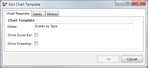
“Show Zoom Bar” controls whether a mini version of the chart will be shown at the bottom of the chart on the Inspection screen. This is useful if users may be zooming a long way in to the chart (which is often the case on KP-based charts, for example).
“Show Drawings” is used to show a drawing as the background of the chart. See Charts and Drawings for more details.
Edit
To edit an existing chart template, select it and click Edit, or just double-click it.
Series
You can add/edit/delete a chart template’s series either by editing the chart template and clicking on the “Series” tab, or by using the bottom half of the main “Configuration - Chart Templates” dialog.
At bottom right is a preview — as you add or edit series, random sample data will display in this preview to show you conceptually what your chart will look like. If you have chosen options that cause the chart to have a legend, the legend is interactive: you can mouse over a legend item to highlight the corresponding item in the chart, and you can click legend items to toggle the corresponding chart item off/on.
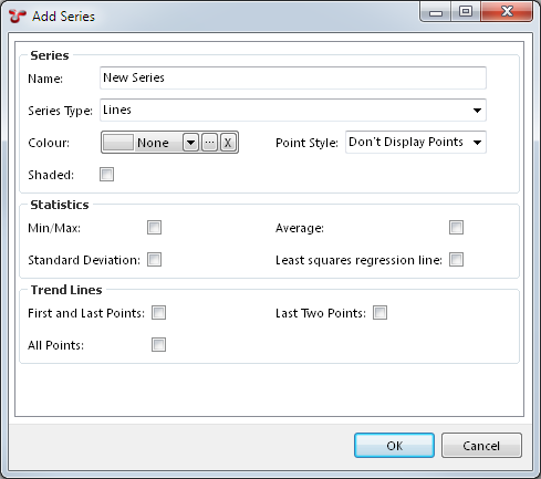
When you add or edit a series, you’ll need to give it a name. If you chart has just one series (this is not uncommon), you’ll often give the series the same name as the chart.
A series also needs a Series Type. Different series types have different properties, which will become visible when you select that type. Available series types are:
- 3D Events,
- 3D Mesh,
- 3D Pipeline,
- Anomaly Trigger,
- Bars,
- Bezier Lines,
- Contour,
- Gantt,
- Heat Map,
- Histogram,
- Horizontal Lines,
- Lines,
- Pie Chart,
- Points,
- Polygon,
- Polyline,
- Vertical Lines.
Points, Lines, and Bezier Lines have more options, as shown in the image. If you tick Shaded, the area under you line series will be shaded in a paler version of the series’ colour. If you tick boxes for the various Statistics and Trend Line items, you will see corresponding lines show on your chart. (Standard Deviation shows horizontal lines one deviation above and one deviation below the mean.)
Axis
When you edit a series, you will be able to configure one or more axes for it, by clicking on the Axis tab. (This tab isn’t visible when you’ve just added a series — click OK and then Edit to make the tab visible.)
Each axis must have a name. If your chart has several series, you may wish to give the X axis the same name in each series, and give the Y axis the same name in each series.
For an X/Y chart you may have two axes, but charts may have more — up to one each of the kinds listed below.
Axis Kind
Available Axis Kinds are:
- X Axis,
- X2 Axis,
- Y Axis,
- Z Axis,
- Z2 Axis,
- Colour Axis,
- Split Chart Axis,
- Split Series Axis.
Conceptually, if you wanted to use some piece of event data to set the Y value of points on your chart, you would add a Series of type Points, and within that you would add an Axis of kind Y Axis, with an axis type of Field, then select the database field you want to use for your Y values. You’d also want to pick something for your X position: you’d add another Axis to your Series, with kind X Axis, and then choose whatever type and other details were appropriate.
Time and KP are both common choices for X Axis field. The X2 Axis is useful for things that cover a span of time or a distance of KP — for example, you could set your X Axis to pull from Event.Start - KP and your X2 Axis to pull from Event.End - KP.
Point, Line and Bezier series have just X and Y axes.
Vertical Line have just an X axis. Horizontal Line have just a Y axis.
Bar series have X, X2 and Y axes: X and X2 are used to define the left and right edge of each bar. Histogram series have just X and Y: X is used to define the centre of each bar.
Gantt have X, X2 and Y: X and X2 are used to define the beginning and end of each horizontal Gantt line.
For a Pie series, you should use an X Axis to give the name of each pie slice, and a Y Axis to set the size of each pie slice. (Pie charts don’t really have an X or Y, so we made an arbitrary choice there.) You can also add a Colour series if you like, to give the colour of each pie slice. (If your pie chart is representing event counts, Table Definition.Colour might be a good choice.) If you don’t specify a Colour series, NEXUS will make up a different colour for each slice.
Anomaly Trigger is like a Horizontal Line series. When you specify a value field for this series, NEXUS does not pull data directly from that field; rather, it looks for anomaly triggers configured on that field, and shows one horizontal line for each trigger. If there are several different triggers on this field (perhaps with different severities or codes), you will get several different lines. The vertical position of each horizontal line is determined by the trigger value. If there are different trigger values for different horizontal positions (for example, a pipeline might have different allowable span lengths at different KP ranges), you can add an X axis of type Auto (see below) and NEXUS will behave appropriately.
The Polygon and Polyline series are very similar — Polygon is a “closed curve”, where we connect the last point back to the first. They are useful where events have defined shapes (e.g. delamination on a concrete wall). See Charts and Drawings for more details.
The Pipeline View is a 3D view, and uses the Y Axis to represent the diameter of the pipeline. If you don’t set a Y Axis value of some kind, you won’t see a pipeline. Because it uses Y for diameter, it uses Z Axis and Z2 Axis to represent distance along the pipeline. As with X and X2, the two different axis types are used to represent the start and end of an item on the “chart”. A 3D Pipeline series is used to represent the pipeline itself, and has Z and Z2 axes which represent the start KP and end KP of the whole pipeline. It also has a Y axis, which represents the diameter of the whole pipeline. A 3D Events series is used to represent events along the pipeline, with Z and Z2 axes representing the start and end of each individual event, a Y axis representing the diameter with which that event should be drawn (diameter is inflated slightly “for free”, to make the events stand out form the pipeline), a Split Series axis (see below) which is typically used to separate different event types into separate series, and a Colour axis, to determine the colour to paint each event. It also has a 3D Mesh series, which is used to represent the seabed. The Z axis is used to represent the KP (i.e. the distance along the pipeline). The X axis is used to represent the distance away from the pipeline. The Y axis is used to represent the vertical distance, to show the actual variation in the seabed.
Contour and Heat Map are conceptually similar. Contour can be used to show contour lines for some “height” value, as seen in a topographic map or an isobaric weather chart. Heat map is similar, but shows the “height” value as a colour axis, instead of as a series of colour lines. You can combine a Contour series and a Heat Map series on a single chart, to give two different representations of the same data.
A Split Series axis lets you split data on one series into several series by some field you choose, such as Asset or Workpack. For example, if you have data in several different workpacks, and you’d like each workpack represented on your chart as a separate series, add a Split Series axis, and set its Parameters (Inputs) to Event.Workpack. Similarly, if you’d like to split data from different assets into different series, you would choose Event.Asset for your input. (Splitting by asset is only useful when the user filters to include child assets in their event listing, and has selected an asset that has children — otherwise, all the data in the listing will by definition be from just one asset.) The series will each show separately in the chart legend, and the user can make individual series visible/invisible.
A Split Chart axis works the same way, except that instead of your data appearing as several series on one chart, they will instead appear as a series of charts, one above another. (Any other series on the chart which don’t have a Split Chart axis will appear on all of the split charts.)
You can add a Split Series axis, Split Chart axis or Colour axis to almost any chart series. For example, a Split Series axis on a Histogram series will give a stacked bar chart.
Axis Type
Several Axis Types are available:
- Auto,
- Average,
- Calculation,
- Count,
- Field,
- Sum.
The simplest axis type is Field: specify a field from a table that you want the chart series to pull data from.
The second simplest is Calculation: specify a function, and specify inputs for that function. (You could equivalently create that function as a field on your form, and then use the Field type, but sometimes you only want the function in the chart, and you don’t want it cluttering up your form.)
Average, Count, and Sum are all aggregate axis types.
The Auto axis type is useful in conjunction with the Solver function element. Suppose you have wall thickness depletion as a percentage, and you want a chart showing how often each percentage occurs. Set up an Auto axis, ranging from 0 to 100, and set up the other axis as a Calculation type. In the function you select for that Calculation axis, include a Solver element. NEXUS IC will call your solver function many times, for different points along your axis range, and those values will get plotted on your chart.
As your Auto axis’ range increases, the step size increases, but not proportionately. This means that if you choose a very wide range (1 to 1000000, say) then your Solver function may get called a very large number of times. That may take a long time.