Report Templates
allows you to create, edit and delete report templates. These templates can be used to generate reports throughout NEXUS IC.
Report templates (once configured), are saved into a Report Category. Additional report categories can be configured (see Report Categories).
You can mark a particular report template as your Welcome Page report: select the template and click the Welcome Page toolbar button, or right-click and select Welcome Page from the pop-up menu. That template will then be exectuted when users visit the WELCOME screen.
Similarly with Dashboard: set a template as your Dashboard report, and each time you visit an asset on the Assets screen with the Dashboard tab visible, your selected dashboard template will be executed. (You should ensure that the template you use does not take long to execute — if it does, you will be waiting every time you change asset with the Dashboard tab visible.) (In order for a Dashboard report to reflect the selected asset in the asset hierarchy, it needs to have Simple Source in it which retrieves VN_ID from a User Input Parameter.)
General strategy
In your final report template, you want to present user-visible things like headings, text, tables, drawings, etc. To power these, you will need Simple Sources to query data from the database. To power any custom columns in the sources, you will need functions.
NEXUS IC’s design lets you create these things in whatever order is convenient to you: you can create all your functions first, then your sources, then the user-visible elements; or you can rough out your report in an empty state by starting with the user-visible elements, and then go on to create the Simple Sources that underly them, and then create the functions needed for those sources. And it’s usually easier to work in this latter way: create your report from the top down.
Add/Edit
To add a new report template, click Add. You’ll have to give your new report a name, and we strongly recommend you give it a category.
To edit an existing one, select it and click Edit, or just double-click it.
In both cases, you’ll be taken to the same dialog.
Report Template dialog
At the top of the dialog, you’ll see Name, Category and Comments.
At the left of the dialog, you’ll see a view of available elements. This is broken into two parts: Sources contains Simple Source, Distinct Source and Union Source, and Elements contains all the things that you can display in the report. Most elements need a source to get data from. A single source can give data to more than one element.
At the right, you’ll see a tree of all the elements currently in the report.
Take a look at some existing templates and you’ll see how they’re put together.
Often the simplest kind of report you’ll want to design contains a single table, displaying data from a single source. To create a report like this, drag a Simple Source from ‘Available Elements’ at left onto the ‘Report Layout’ element at right, and drag a Table of Data (or a Vertical Table or a Pivot Table) from ‘Available Elements’ to ‘Report Layout’. (In general, you can drag elements onto the root ‘Report Layout’ element, in which case they will appear at the bottom of your report; or drag them onto another element, in which case they will appear just above that element.)
If you click the Generate button (and select an output format), you will get a blank report generated.
Sources
Simple Source
You can edit the Simple Source by double-clicking it. You can choose a table for this Simple Source. The table you choose will obviously depend on the data you want to show: if you want to display GVI event data, you would choose you GVI event table. If you want to display data about events overall, you would choose the Event table. And so on.
Fields
The second tab on the Simple Source dialog is Fields. This shows you all the fields in the source you’ve selected, plus any extra columns you may have added. The Show Local Columns button controls whether fields in this source are selected.
Filters
The third tab is Filters. Here you can control which rows are returned from the table. If Parameter is set to None, you will be able to immediately choose a value.
If this is a string or a numeric or a whole number field, you can simply type a value in.
Some fields are keys to other tables. For example, in the Event table, Asset, Event Type, Survey Set, and Workpack are keys to other tables.
If your filter field is a key to another table, you will be given a  button to allow you to pick a value. For example, if your source table is Event, and your filter is on Workpack, clicking the button will bring up a list of workpacks to pick from. If your Comparison is ‘=’ (equals), you can pick just one item; if your comparison is ‘in’, you can pick several items by checking the checkboxes next to each desired item.
If the field you want to filter on is in this table, click the  arrow to choose it from the list. If it’s not, you can click the button to pick the field you want from any table. NEXUS IC will figure out a path connecting the Table you selected to the field you have selected. If there is only one such path, NEXUS IC will choose correctly; if there are multiple paths, you may experience unintended behaviour.
‘like’ is only applicable to string comparisons: use ‘%’ (percent) to match several unknown characters, and ‘_’ (underscore) to match a single unknown character. For example, Name like _VI would match ‘GVI’ and ‘CVI’; Name like ‘PL %’ would match ‘PL Anode’, ‘PL Damage’, etc.
‘<’, ‘>’, ‘<=’ and ‘>=’ are only meaningful for numeric and whole number types — their behaviour on key fields are undefined.
If you would like to test whether a key is null, just use ‘=’ as the comparison, and leave the value blank.
If Parameter is set to User, then when the user runs the report, they will be asked for a choice. The equals/in rule described above still applies: if you choose ‘=’ for your Comparison, the user will be able to choose one item; if you choose ‘in’, the user will be able to choose several items.
Asset selection is a special case: here, the correct field to choose is ‘Asset Location.VN_ID’, and ‘Is Child Of’ is added to the Comparison list. An illustration of how to configure a filter to let the user choose a single asset, and have the query report on that asset and its children is shown here:
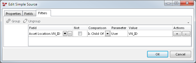
If you wanted to report on just that asset, you would use ‘=’ as the Comparison, instead of ‘Is Child Of’. If you wanted to let the user select several assets, you would use ‘in’ as the Comparison.
Other special cases exist for reports run from the Reports menu button on each screen in NEXUS IC:
| Screen | Parameter |
|---|---|
| Assets | View_Node |
| Library | Library |
| Planning | View_Node |
| Workpacks | Workpack |
| Inspection | Header / Finding (depending on what is visible) |
| Anomaly | Anomaly |
If you use one of these special parameters, then when a user runs your report template from the appropriate screen, the currently selected item will be pre-populated into the parameter in the report generation wizard. For example, if you set up a report template with an Anomaly parameter, then when the user runs your template from the Anomaly screen, the currently selected Anomaly will be automatically selected in the report wizard.
The Parameter choice of ‘Group’ only has meaning if this Simple Source is inside an Element Group (available from the Available Elements list at the left of the Report Template dialog). If you choose ‘Group’, then this filter will pick its value from the Simple Source used for the Element Group.
Filters can be connected by “All” or “Any” connectors. If you have multiple filters, you’ll see a drop-down appear at the left. If you select All, then all these filter criteria must be met for data to be returned. If you select Any, then if any criterion is met, data will be returned. (All and Any are equivalent to SQL’s AND and OR.) You can construct more complex combinations by grouping rows: use the Shift and/or Ctrl keys on the keyboard and click filters to multi-select. Then click Group. The rows you selected will be joined together into a group with their own Any/All filter, and that group will be connected to other groups with a separate Any/All connector. By choosing your grouping and choosing Any/All as appropriate, you can construct any logical expression you desire. You can ungroup rows by selecting a row within a group and clicking Ungroup.
Distinct Source
Sometimes, you want just a subset of a table’s rows, showing each value (or combination of values) just once. (A common reason for this is as the source for an Element Group.) Suppose you wanted a list of Task Categories that were actually in use. (This might be different from the full list from the Task Category table.) Create a Simple Source and set its Table to Task. Then create a Distinct Source, set its Source to your simple source, and then select the Category column. Now this Distinct Source is a data source that you can use in an Element Group (or anywhere else) that will have one row for each value of Category found in the Task table.
(Another way of grouping rows is by using a Pivot Table.)
Union Source
A Union Source lets you join together results from several other Sources, much like SQL’s UNION ALL. In the Union Source, select the sources you’d like to pull data from. Only columns that are common to all selected sources will be passed through to any element that consumes the Union Source. So if you chose two tables, both of which had a Name column, your Union Source would have a Name column.
Elements
Element Group
Element Groups are used to repeat data for a series of records or to group sections of a report. For example, tabulate anomalies for a series of workpacks. You can also use the Conditions in an Element Group to make the group and all its contents only appear if the conditions are matched.
You’ll need to select a Source for this Element Group. (It must be a Source outside the Element Group.)
If you check the Repeat Elements box, all the report elements within this element group will be run once for each row in the source.
Checking Repeat Elements will also cause the Action drop-down to appear. You can select ‘All Rows’, ‘Only rows that match conditions’, ‘Only rows that don’t match conditions’, or ‘Only when there are no rows’. If you select either of the ‘conditions’ options, the Conditions box will appear. Click its button to add, edit or delete conditions. Conditions can be on a field in the source, or on the number of rows in the source, or the index of the row, and can compare (=. <, >, <=, >=, <>, contains) to a constant value.
You can drop elements, including Simple Sources, into the Element Group. In the Filters tab of a Simple Source within an Element Group you can choose a Parameter of Group. This will compare the field you have selected to the value in the current row of the Element Group’s Source.
Text (Paragraph)
Text entered into the Content field will be displayed as text in the report output. Use the right click menu to insert System Fields, set the style of the paragraph text (the Body Style will be applied by default).
Section Heading
This element lets you set up headings in your report. Right-click within the Content box to get a list of styles and fields, or simply type text. Check the Include in Table of Contents checkbox to have this section heading appear in the Table of Contents.
Table of Data
You can edit the Table of Data by double-clicking it, and choose a Source. If you only have one Source in the report template, only one item will be shown on the drop-down list.
If you click OK after selecting a Source, you will see a ‘+’ next to the Table of Data. This shows the Simple Source you have attached to the table. This is really the same object as the Simple Source shown elsewhere in the tree — making changes on one will make changes on the other. If the Simple Source is connected to several tables, Drawing Details, Chart Templates, or Risk Charts, making changes to any one will make changes to all.
Hint
Once you have set up a Table of Data, and have connected it to a Simple Source which in turn has a database Table selected, you have a basic report which can be generated to RTF, HTML, or Excel.
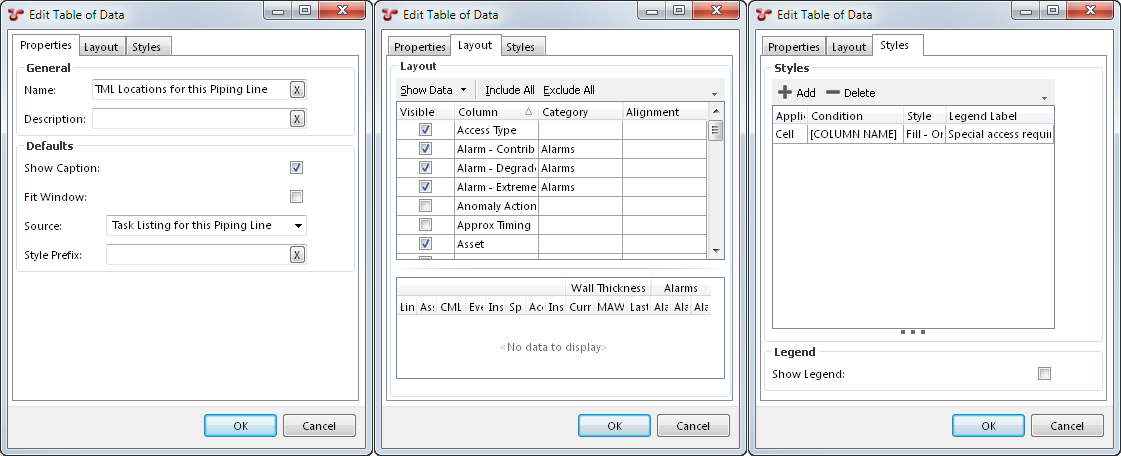
If you give the Table of Data a Name, and check the Show Caption checkbox, the table’s name will be shown above the table in the generated report.
Note
Only tables with data will be shown in the generated report. If a table has 0 rows, it (and its caption) will not be shown.
If you check the Fit Window box, NEXUS will constrain the width of the generated table to the width of the page (in RTF) or the browser window (in HTML). If you uncheck this box, the table should be as narrow or as wide as is needed to display the data. Please note that Microsoft Word’s RTF reader does not respect this setting well. To get Word to respect the setting, it is necessary to encourage it, for example by clicking Save As in Word and choosing .docx as the save format.
Style Prefix lets you set a Style Prefix.
Layout
The top half of this pane lists all the columns. Tick or untick to make columns visible or invisible. If you place several columns in the same Category, they will be grouped together. Any Category headers will also be visible in the generated report.
If the Show Data button is set to All Data, NEXUS will display data from the table specified in this table’s source, complete with any extra columns you may have added. This can give context and make it easier to understand what the final generated table will look like.
Caution
If the table contains many rows, this may take up to 5 seconds. After this time, NEXUS will stop fetching additional rows, and will display only the rows that it has fetched.
Click on one or more column headings to sort by that column. Shift-click a column to add it; ctrl-click a column to subtract it from the set of columns we’ll sort on. Click (or shift-click) a column a second time to change sort direction.
You can change the width of columns by hovering the mouse over the right edge of the column header, and then either double-clicking or by clicking and dragging the column to a new width. This will change the column widths in the generated report.
Styles
The Styles tab can be used to highlight table cells or rows, use particular fonts, sizes or colours, change spacing, and to change the lines used to draw the table. You can choose a style here to be used when particular conditions are matched. To add/edit/delete styles themselves, drop back out to the Configuration - Templates dialog and click the Styles button.
Vertical Table
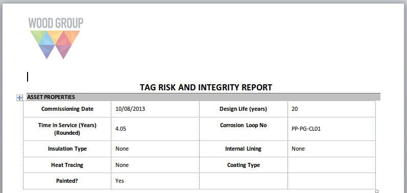
The Vertical Table element is like the Table of Data element, but rotated 90 degrees: what would be a column in one is a row in the other. ‘Column headers’ are in the left-most column. Show Caption, when checked will output the Name of the Vertical Table directly above the Vertical Table. When output to RTF, Fit Window will make the Vertical Table stretch from the left page margin to the right page margin. You can choose how wide the header Column is by setting a Header Width (%) value. Entering 2 or more Number of Header Columns arranges the output fields in a form-like layout. This is most commonly used when you are outputting the details of single record. Example shown here:
Style Prefix lets you set a Style Prefix. The Styles tab lets you set conditional Styles for this table.
Pivot Table
Pivot tables are conceptually similar to pivot tables in Excel. (If you aren’t familiar with those, you may wish to Google for a tutorial.) They aggregate data from many rows of a data source into just a few rows, according to the rules you set up.
As always, you’ll need to start by selecting a Source for your pivot table element. Then choose one or more Rows. For example, if you wanted to see how many tasks were in each workpack, you would set up a Simple Source on the Task table, and in your pivot table you would choose Workpack as the Row field to pivot on. (If you wanted that broken up by task completion, you would choose Workpack and Is Completed as Rows — the table would then contain two rows for each workpack that had both completed and uncompleted tasks.) Under Values, click Add, and select criteria. if you wanted a simple count of tasks, you would choose Task_ID as the Field, Count as the Aggregate, and choose a Name like ‘Number of Tasks’. That completes the minimum for a Pivot table element: a Source, a Row Field, and a Values entry.
You can do much more with pivot tables, though: you can have several different Values entries. For example, you might add a second Values entry on Approx Timing, with an Aggregate of Sum, and a name like ‘Total Time Estimate’. Each additional Values entry will result in an extra column in the output table.
You can separately choose the Aggregate (Total), which is the value shown under Column Totals or Row Totals (if selected). Sometimes you want the same aggregate for cells within the table and for end-of-row or end-of-column values (for example, for a Value where you’ve chosen Average, your might want Totals to also be Average, giving a grand mean), but sometimes you want the Total value to have a different aggregate from cells within the table proper.
You can also add entries under Columns. If you added, say, Category, under Columns, and your tasks were assigned to different categories, then you output would have one column per category for whatever your Values entry specified. If you add items under both Columns and Values, then it works multiplicatively: if your Tasks fell into five different Categories and you had two different Values, you’d get 10 columns of number out. For each Column you select you will get a common table “band” header, and within each band you’ll get columns for each Value.
You can also have a more complex source: for example, if you only wanted to see incomplete tasks, you would put a filter in you Simple Source for Is Completed not equal to true. If you wanted to use a single Simple Source to show both all tasks and all completed tasks, then instead of filtering the Simple Source, you would add an extra field to it, with a function that returns 1 if the tasks is complete and 0 if it is not. Then you would add a Values row to Sum that function.
There are checkboxes near the top of the Pivot Table element. Show Caption does the same thing as for a Table Of Data: it shows the Name as a caption above the table.
Show Column Totals adds an extra row at the bottom of the table showing the aggregate of values in each column. Show Row Totals works similarly except that it adds an extra column, with the aggregate of each row. If you have several Values, it will add several columns, one showing the aggregate of each.
Show Zero Values, by default is checked. If unchecked, will replace any values that would have shown “0” with a blank. This makes it easy to spot data in a sparsely populated grid.
Show Rows with all Zero/Blank values, by default is checked. If unchecked, rows which contain all “0” or blanks are not shown. This limits the pivot table to only rows which have aggregate data.
Show Dash instead of “NaN” by default is checked. If unchecked, then “NaN” (Not a Number) will be output as “NaN”.
Fit Window doe the same as for a Table Of Data: it will attempt to make the table as wide as the browser window or Word page.
Style Prefix lets you set a Style Prefix.
The Styles tab lets you set conditional Styles for this table. In your Conditions, set Field to [Column Name], Comparison to Contains, and Value to the column name. This is because as far as the pivot table is concerned, it’s not using the underlying data source column — it’s using a new pivot table column with a similar name.
Risk Chart
Choose a Source. Typically, your source for this element will use Risk Assessment as its Table. If you click Show Count, your final risk chart will have a number in each square that has risk results, showing how many risk results are in that square. If not, it will merely have a dot in each square with one or more risk results.
You can also use the Anomaly table as the Source for a Risk Chart. Each anomaly’s Risk Score is used to place it on the diagram. Note that anomalies do not have a Likelihood or Consequence to give them an X/Y position on the diagram – they only have a Risk Score. So if your diagram has several squares with the same Risk Score (as is usually the case), your anomalies will be placed in the left-most such square. That is, risk-assessed assets are placed in a particular square, but anomalies are merely placed in a particular band.
To make this matrix work, you will need to configure . You will also need to configure the “System - Anomaly - Risk Score” function.
Multimedia Thumbnails
Choose a Source. Typically, your source for this element will use Multimedia as its Table. Caption may be Name from the Multimedia table, or may be a function column that returns details about the event type and event number. Repository Field should be Image from the Multimedia table.
Drawing Details
Choose a Source. Typically, your source for this element will use Library as its Table. Caption Field is used for the text underneath the drawing, and may be Name from the Library table, or may be a function column.
Under layers, if you select “Display all layers” or “Display only layers that are associated with assets in asset source”, you can specify a Source, and then specify the fields within that Source to be used for the Asset (i.e. the Component_ID), the Name (such as Asset.Name, or any other field that will be meaningful to the person reading the report), and optionally the Colour.
Page Break
In addition to forcing output onto a new page (in RTF only, as HTML and Excel do not have the concept of pages) this element lets you set headers and footers for your document. Columns something something.
Section Break
Similar to Page Break above, but will not force a new page and does not let you choose paper size and orientation.
Table of Contents
The Table of Contents element inserts a hyperlinked Table of Contents for the report. In HTML outputs, any section headings will appear with “Back to top” hyperlink.
Style
The Styles dialog lets you define the look and feel of the final report by pre-defining the fonts and colours for the various styles in the report.
To edit the Styles used in reports, click the Styles button. Choose the Style to edit from the list box in the left of the dialog and update the font, colours, spacing, alignment and font style.
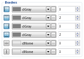
When defining borders for styles, you must ensure that the border icon is in the “down” state (see below).
Many of these styles are applied automatically to report elements where appropriate. For example, “Table Heading” will get applied to headings in tables (including Category bands); “Table Event Rows” will get applied to even-numbered data rows in tables, etc.
For Pivot tables, the following styles will be automatically applied (if they exist):
- Table Heading for headings
- Table Row Odd & Table Row Even for odd & even rows
- Number for cells that contain numbers
- Total for total cells
- Total Number for total cells that contain numbers
Note
Excel reports will ignore many style settings, in favour of using Excel’s own style settings.
Note
In an RTF report, if the NEXUS style name matches the name of a style used by default in Word or that appears in your .dotx Word template file, the generated text will appear in that Word style, so you can use Word’s styling tools to modify it once the report has been generated.
Style Prefix
Table of Data, Vertical Table and Pivot Table offer a Style Prefix. If you fill this in, the table’s style prefix will be added in front of any style name applied. So if you set a prefix of “Large”, then the table’s heading cells will be styled in “Large Table Heading” instead of just plain “Table Heading”, and so on. This lets you apply different styles to a table or tables. (There is no automatic fallback, so if you specify a style prefix, you should create an appropriate matching set of table styles with that prefix, including as many of “Table Caption”, “Table Heading”, “Table Even Rows”, Table Odd Rows”, “Total”, “Number”, “Total Number” as you want formatted.)